
Last updated on June 26th, 2022 at 11:41 am
Wondering how to make 2017 Twenty Seventeen theme full width? Well, one of my customers is using 2017 Twenty Seventeen theme for their main site. And all I can say is that this theme rocks.
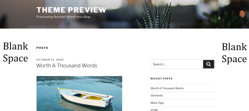
However, it comes with a lot of unused blank space on both sides by default. Actually, that was one of the requests from my customer. They wanted me to help them remove the unnecessary white space on their main site.
To make your 2017 Twenty Seventeen theme full width, paste the following code in Appearance -> Additional CSS.
.wrap {
/* margin-left: auto; */
/* margin-right: auto; */
max-width: 100%;
/* padding-left: 2em; */
/* padding-right: 2em; */
}
@media screen and (min-width: 48em) {
.wrap {
max-width: 100%;
/* padding-left: 3em; */
/* padding-right: 3em; */
}
}
.page.page-one-column:not(.twentyseventeen-front-page) #primary {
/*margin-left: auto;*/
/*margin-right: auto;*/
max-width: 100%;
}
@media screen and (min-width: 30em) {
.page-one-column .panel-content .wrap
{
max-width: 100%;
}
}
Once you Save the changes, your site should be full width.
You can further tweak the width by changing the values for max-width: 100% to your preferred ones.
Hope this helps you too. Cheers!